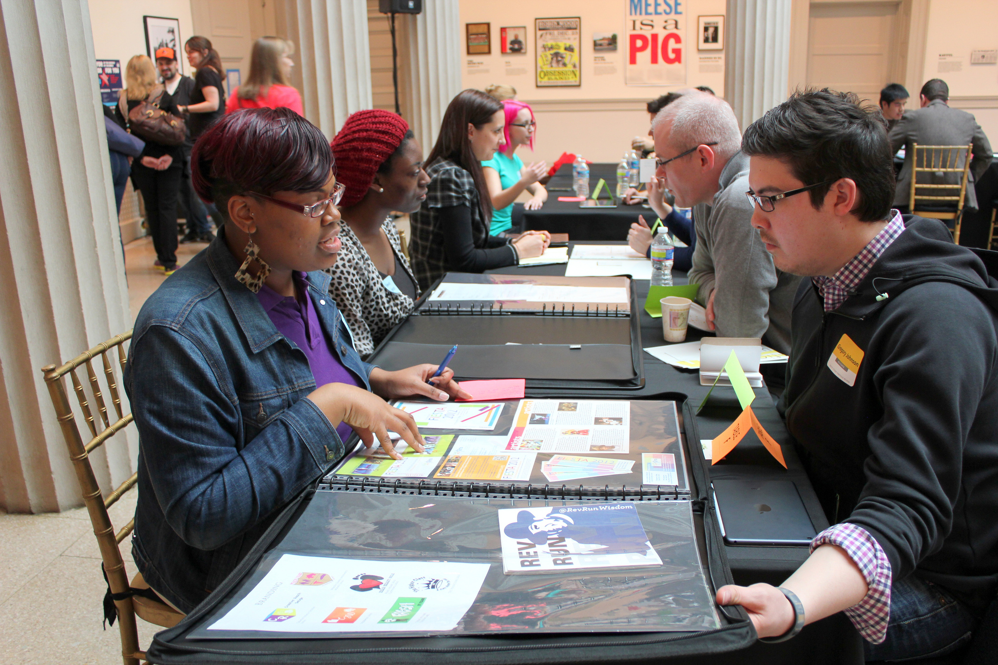
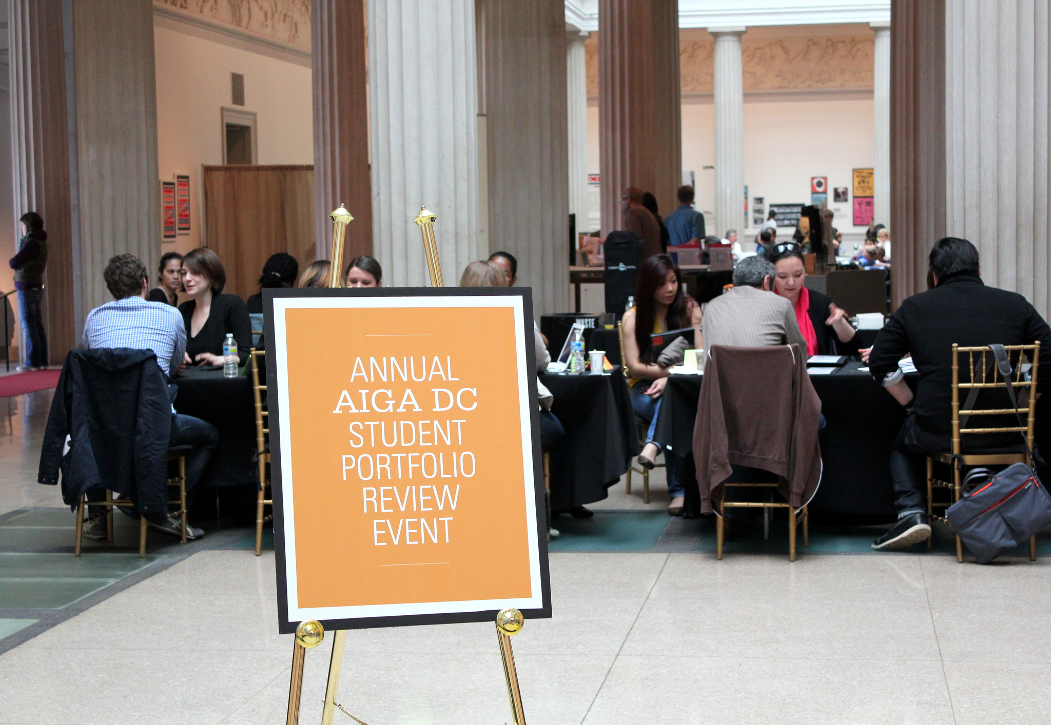
Ahead of our annual Student Portfolio Review, April 25, we asked reviewer pro Anne Kerns to give us some pointers on creating the perfect package. Anne is Owner & Chief Creative Operative of Anne Likes Red, Inc.
What should be included in a print portfolio?
Your best work! Ideally, it should be work you want to do more of, work that interests you. A portfolio is not just a record of what you’ve done, it’s also aspirational. A fairly decent range should be included, but not all over the place. Pick your best three pieces and put them first, middle, and last. That way you start out with a strong impression, reinforce it in the middle, and end strong. But you also have to arrange them in a way that makes sense and tells the story of you as a designer. You want to demonstrate that you’re on your way to developing an expertise or two, not that you are master of none. I took a photography class in college but there are never photographs in my design portfolio. I hire photographers for photos, not designers.
What should not be included?
Production pieces or learning pieces, put those in the proverbial back pocket; don’t let a piece take up valuable portfolio real estate just because it was printed. In a job interview, if you’re asked about your production skills, or if you’ve had things printed, then you can pull them out.

How much should be included?
The sweet spot, in my opinion, is somewhere between 8-12 pieces for an in-person portfolio review, but nothing should be forced. If you only have 7 really good pieces, then that’s your answer. If the work is really strong and unique, then maybe 14 works. For short portfolio review sessions, however, if your book has more than 10 pieces, you’ll want to try to control the timing to make sure that you get feedback on everything.
If you are a multi-talented, Renaissance creative person, great! Then you need more than one portfolio. Put your illustrations in one portfolio; put your photography in another; put your design work in another; put your video in another; and so on. If you want to show it all, then incorporate those skills, talents, and media into your designs.
What format should it take: standard or creative?
Neat and clean. Something that doesn’t get in the way of presenting the work in its best light. If you mount on boards, make sure that all your boards match exactly and don’t have stains. Mount your work evenly. Use fresh blades. Craft matters. If you make printouts, the toner should be consistent, the paper should be sturdy, etc. Attention to detail matters. If you don’t present your own work with care, why would someone who is hiring think that you will treat client work with a high degree of attention? Perception is key.
When I make new client presentations, I bring my portfolio of print pieces in an aluminum case. I think it makes a nice impression, and I get compliments. It also accommodates the range of sizes I need. There are many less expensive options, but I think we can all agree that the reddish-brown paper, wallet style is not a good look.
What about online portfolios? Are they for everyone?
Everyone should have some type of online portfolio. There are numerous options, free and paid. Something for everyone. CreativeLive even has a class on creating a knockout online portfolio if you’re really clueless. There’s some good advice here: https://www.creativelive.com/courses/create-knockout-design-portfolio-ram-castillo.
What was the most memorable portfolio you have seen?
I’ve seen a few really outstanding student portfolios over the years, but the most memorable was a student who was a junior and the work was really not very good. Actually it sucked. I felt so bad for this person. However, they had a really great attitude, and was there to get advice and get the most out of the day. I know that it’s hard to hear criticism, but I tried to offer concrete things to work on in the coming year and complimented them for their truly engaging personality. As it turned out, a year later, this very same student joined my senior design class and produced a terrific senior book project. In the intervening year this young designer had worked on all the principles we discussed, and even though that afternoon was painful, it was a moment of growth. I think the point is that reviewers should be sensitive but honest, and students should be open to the constructive criticism being offered by working professionals. Designers are not born designers. We learn, we train, we get better.

Join AIGA DC on Saturday, April 25 for the 2015 Student Portfolio Review.
%8Fv%91%92q%1D%7D%12%88%98%99%9A%1B%9C%10%88%89%9Fy%93%A2%86%1A%9E%A7%8B%8C%2F%AB%18%A5%AE%A0_%AA%8E%AC%90%B5%B6%60%19%A3%0D%AD%BC%AF%A1(%B2%9D%BB%C3%C4h%BF%C7%A4%C9%CA%A8%A9A%CE%0E%B4%D1%BD%7B%10%C0%0A%C2%D8%D2%C5%DB%D5%0C%D7%DF%CB%B7%13%B9%C8%97x%02%EE%02%2B%B0%D47%13%DEln%1E%EF%EF'%F2%2B%F6Zd%3A%E8%1Bhb%9A%3Fv%F7%DAp%18%C8%90%84%C1%13%D0%C6%94%CB%C0%B0%E2%08f2%14%02%2Ce%8A%FFb%C5%86U%B4%B5(%B3%91%A3%C0%8F%20%CD%CD%E2%08h!%CA%94*%AD%B1l%99%EF%25%C1%98%0Bf%D2%1Ca%F3fL%9D%F8X%F4%D4g%0EhG%17C%F7%0D3%EA%23%A9%3B%5EL%818u%054%C9P%AA%2C%DF%D8%C4%FA%8F%CAK%AE%08%15Y%AC%15%F6%13%D1%A5%3Bq%AA%5D%CB%B6%AD%DB%B7p%E3%CA%9DK%B7%AE%DD%BBx%F3B4%DA%F5%1B_a%7F'%16%0D%0C%89%B0%E0h%86%13%F3%FD%A9%B8qV%95%8E%23%F7%85*%D9Me%B5%97%BB9f%1BY%AF%E7%CF%A0C%8B%1EM%BA%B4%E9%D3%A8S%AB%C6A%92r%D0Se1%C5~s8P%ED%24%26a%DF%1E2%13%EC%E4%1CUu%F7%06%12%D5wn%E0%C1%5D%0F%9FQ%1Cq%F2%83%3A1%3FO%F8Xzt%EA%C7%DB6%AFs%5D%EE%F4%95%D5%25%BEv%D1Z%7Cv%F0%BB%EB%05%CC%B8%DERz%99%BF%D5kd%11%91%C3y%F9%F3G%D4%2F%B1%DF~%FF%08%BC%F9%E9%F7_I%EDaW%12t%01%3EP%DE3%B3%B9g%DB%80%9A-%A8%20%84%8CAha%7C%90Q%A8!%85~a%B8!%87%CE5%18%8C%88%E4%80%88%16%89%25%26%C8%A0%8A%19%A2%98%93%8B%11%B2%D8!%8C1J%08%A0%89%9F%BC%97b%81%F8%C9x%A2%8F%F0%F1%D8%A3%8D%CA%E8%B8%23%91%2B%02)%9C%92%232y%24%92%C6%A55%E4x~%E0H%9B%95%04%60%89%A1%22%5B%06%09%E5%8D4%9Aa%A4%97RNY%26%97X%D6x%E6%3ANv%91%A6%9ATr%D7%26%15of%19%26%99q%E6(%A4%7Fs%929%E3Q%EE%7D%89%1Eiu%AAVhj%87%A2%96%E8i%8B%9A%D6%A8%A3%7B%AE%C6'%A0%AE%24%00%00!%F9%04%05%05%00%04%00%2C%0A%00%02%00W%000%00%00%03%FFH%BA%DC%FE0%BE%40%83%BC8%EB%3D%2B%E5%60(J%9E7%9E(WVi%EBv%EB%2B%BF%EB7%DFgm%E1%3C%A8%F7%23%81P%90%FA%A1%00H%40k8D%19G%C9%24%8A%C9%CC%D5N%D1%E8%89%DA%1C%3DCYi%90%2B%F4%5EEa%B1%88%DC%F5%9DAi%F5%9A-%FAn%E2%CA%14%9B%E8%8E%C1%E3.%7B!v%19x%2F%82*o%1A%86%87%88%1A%84%12xy%8Dd%89~%8B%803%7B%7C%19%90%10%928%8E%18%9E%0F%8C%A1t%9D%8A%91%99%3C%A2%24%AA%11%A6%AD%A8%17%A4%0C%B2%B3%B4%11%B6%0A%A0%40%0A%AE0%25%18%B8%3D%9B%B5%B0%0D%BE%BF%C0%BA%10%97%B1%AC%10%03%D4%03%81%CE%C2%C4%D2%0F%D5%D5K%D8G%DB%0D%DD%E4z%952%E2%E3%E4%E5c%5C3%E9%0C%EB%F2%EDm%E8Y%18%F2%F3se%3CZ%19%F9%FA%98%09%04%18P%E0%2F%82%EB%0C2C%C8N!%10%86%DD%1C%1E%84HMb%0F%8A%15-%F2%C0%A8%F1%13%22%C3%8E%0F%09%82%0C%99o%E4%C4%86%26IZK%A9!%01%00!%F9%04%05%05%00%04%00%2C%1F%00%02%00W%000%00%00%03%FFH%BA%DC%FEKH%01%AB%BD8%EB6%E7%FE%60%A8u%9Dh%9E%22%E9%A1l%5B%A9%92%2B%CF%04L%D1%F8i%E7%7C%B8%F7%A2%81p%C0%FA%9D%02%C8%40k8D%19E%C9%24%8A%C9%D4%C1%8EQ%A9%89%DA4%3DAYm%90%2B%F4%5E%A1a%E4%89%DC%05%7D5i%F1%98%9C%3A%83%E3K%B6%CF%BE%89%2B%F3tn%7Cpx.lD%1Fo%17~3%87%88%23%83%8B%8C%8Dz%1B%8A%15%93%94%95%19%97%0F~%7F4%87%96%91%98%859%A2%9C%A4%9E%A6%A7%9B%17%9D%0D%99%3C%A8%AF%AA%B1%AC%B3%B4%2F%B6%0B%9F%40%0B%BA%10%B0%0A%B2%40%8E%B5*%92%B8%C6%AE%C2%24%18%C5%BF%04%C1%0F%25%CAa.%00%DA%00%18%D4(%D1!%DB%DB%DD%812%CB%20%E2%E9%17%CD%2C%E7%1A%E9%F0%E4U8%D8%22%F0%F7%19%F39Q%26%F7%F8%D2%D2%FC%FD%03%D8C%E0%40%828%0C%C6C%C8C%A1%3A%86%09%1D%8E%83HC%E2D%8A3%2Cj%C3X%D1%14%22%C7%88%0A%3F%E6%08)r%A4%C0%92%05%17%A2L%B9%D1D%02%00!%F9%04%05%05%00%04%00%2C%3C%00%02%00B%00B%00%00%03%FEH4%3C%FA0%CAI%AB%9D%AD%DD%CD%7B%CD%99'%8E%16%A8%91hj2i%3B%AE%8E%2Bo%F0l%7F%EB%ADG%B5%2B%FC%82%DD%A3%97%02%02%85%8B%5C%D1x%DC%11I%CC%A6%EE)%8AJo%D4%8E%F5j%CBr%B6A%A1%F7%02F%26M%D0%ADy%5C)%AF%95Z7%92%3D%91%CF%E1%1Bp%F8%8D%8E%5B%CDCx%16v%7C%20~Q%80%81%7Ddj%89%0At%0Az%8E%8F%82u%8D%93%90%92%93%94!%8C%7F%9B%8A1%83%97.%01%A6%01%3B%84(%A7%A7%3A%A4%AB%AC%AC7%AF%22%B1%B6%AEL)%B6%BB%A9%5C%1E%BB%BC%A0%1B%C0%C1%C2%15%C4%C5%C6%12%C8%B7%CA%14%CC%B1%CE%13%D0%B2%D2%11%D4%AD%D6%D7%D8%A8%DA%10%DC%DE%CB%D0%E1%D3%C8%E4%CF%C4%E7%C7%CD%EA%EB%A6%ED%F0%F1%F2%F3%F4%F5%F6%F7%F8%F9%FA%FA%00%FD%FE%FF%00%03%024%26%B0%A0%C1%7F%A0%0E*4%B8i%A1%C3%81%93%1EJ%04%D0p%A2%C3%84%16%0F%12%CC(%03PA%02%00!%F9%04%05%05%00%04%00%2CN%00%0A%000%00W%00%00%03%ECH%BA%BC%F3%A3%C9I%2B%85%D0%EA%7Dq%E6%E0%E6%7Da)%8D%A4%A9%A2%A9Z%B2%91%BB%B2%B2%0B%D7%E6%8D%87p%BCs%BA%9F((%B4%10%8B%1D%14r%A8%5CV%8ENF%2F%9A%1CQ'%D3k%03z%E5%AA%04%60%81%91%B6%0B%87%9F%CD%9Ay%5D%C5%A8%D7%EC%B6%CF%04%AF%8F%1F%B2%BA%9D%AA%DF%3B%FB~H%80p%7C%83fQ%86%87%7F%89%60%85%8C%8E%86Z%89Z%0A%83%94%0B%80%97%0C%81%9A%95g%9D%A0%A1%A2%A3%A4%A5%A6%A7%A8%A9%AA*%01%AD%AE%AF%B0%B1%B05%B2%B5%B6%AF.%B7%BA%B6%AC%BB%BE%B8%26%BF%C2%01%BD%C3%BB%B9%C6%B7%B4%C9%B2%AB%CE%CF%D0%D1%D2%D3%D4%D52%00%D8%00%A5%D9%DC%A2%DC%DF%DA%9D%E0%DF%E2%E3%E4%94%E6%E3%E8%E9%E0Z%EC%ED%EE%EF%DD%F1%F2%D8%F4%F5%EB%F5%E1W%FA%FB%FC%F8%F9%D8%95K%17%8A%A0%B7s%A3%E6QH%00%00!%F9%04%05%05%00%04%00%2CN%00%1F%000%00W%00%00%03%E9H%BA%DC%FEn%C8%01%AB%BDmN%CC%3B%D1%A0'F%608%8Eez%8A%A9%BAb%AD%FBV%B1%3C%93%B5v%D3%B9%BE%E3%3D%CA%2F%13%94%0C%81%BD%231%A8D%B6%9A%8F%1C%14R%9B%F2L%D6%AB0%CB%EDz%BF%E0%B0xL.%9B%CF%5C%81z%CDn%BB%DB%B3%B7%7C%CE%5E%D1%EF%F3%13~%0F%1F%F1%FF%02z%80%7Bv%83tq%86oh%8B%8C%8D%8E%8F%90%91%92%93%0A%01%96%01f%97%9Ac%9A%9D%98%60%9E%9D%A0%A1%A2%5D%A4%A1%A6%A7%9E%5C%AA%AB%AC%AD%9B%AF%B0%96%B2%B3%A9%B3%9FY%B8%B9%10%00%BE%00%2F%B8%15%BF%BF%C1%B0%BD%C4%C5%C6%A7%C8%C9%C07%CC%0F%CE%CA%D0%A5%D2%D3%CF%3B%B1%C3%D8b%D8%BE%DE%DDa%DF%D9_%DFc%E7%E3%E2%EA%D3%E1%EB%E6%EF%5E%E4%EE%CE%E8%F1%5D%E9%EC%F5%FA%FB%60%F9%FE%ED%E8%11%23%D3%CF%1E%B8)%09%00%00!%F9%04%05%05%00%04%00%2C%3C%00%3C%00B%00B%00%00%03%F9H%BA%DC%FEP%8DI%AB%BD6%EA%1D%B1%FF%15'r%60%F9%8D%E8c%AEY%EAJl%FC%BE%B1%3C%BB%B5y%CF%F9%B9%FF%C0%A0pH%2C%1A%8F%C8%A4r%C9l%3A%9F%D0%A8tJ%10X%05%D4%D7u%9B%1Dm%BF%D8%AE%06%FC%15G%C8%60%B3%03MV3%D8mw%15%5E%96%CF%E9W%FB%1D%1Fv%F3%F3v%7FVz%82F%01%87%017%7FD%88%88%8AxC%8D%8D%3Bt%91%92%87%40l%96%97%89%99u%11%00%A1%00%1C%9C%98A%5C%1A%A2%A2%A4%A5O%AA%AA%1B%A5%A6L%AF%AB%B1%ADM%B5%A1%AC%B8K%BA%A3%BC%97%B9%BA%23%B2%B4%C4%22%C6%BE%C8%C9%BDH%BF(%B2%9D%CF%CC%CD%9CJ%D0%D1%CAG%D9%DA%D7%D4%B5%2F%DBE%DD%DE%C2%DC%D5%E6%92%E8%E1%E2%E3B%E5)%EFA%F1%F2%DFD%F5%EA%8E%E4%E9.%E7%FC%EDvLb%F7J%8F%83%7Cv%10%CAQ%E8%86%A1%1A%87%0F%0B%1A%7C%00kb%83%04%00!%F9%04%05%05%00%04%00%2C%1F%00N%00W%000%00%00%03%FFH%BA%DC%FE0%CA7%EA%988%EB%CD%89%FD%5D(%8E%CDg%5Ed%AAJ%A7%B9%BE%B0%D7%BAq%1D%CE%AD%ADkx%BE%FF%90%DE%09Ht%08i%C5%E4%11%94%2C.-M%E5%13%15%05N5%80%2C%E0'%E8%0AFO%8CV%AB%F3z%C1%C7%C9x%5C3%9BIB%F5%3A%DBvwU8%C9%9C%1C%B3%9F%F1H%10%7Bt%13%01%86%01%18~w%2BL%11%83%5B%85%87%86%89%8AQ%8F%90%11%92%92%13%8A%8BE%8F%18%9A%87%94~I%97%A1%A2%88%9C%9D%9F%83%19%A9%AA%AB%A5%40%A0%AF%A9%1A%AC%3F%B5%A8%A2%B8%95%3B%BB%BC%9A%1B%B95%A7%1A%B0%C4%C50%C1%C2%9B%CA%B3%CC%CD%91%BD%D0%D1%2B%D3%D4%C3%1C%CB)%D9%DA%CF%DC%BF*%DF%12%C9%1D%DD%22%E5%E6%B7!%E9%1C%C7%1D%E7%E8%EFX%AE%22%F3%F4%D7%1D%F7%F8%ED%22%E3B%F4%0B%91O%9F%1BokR%144%E8%89%04%1B%85%FFF%BC%A9%E2l%14%C5(%0B%2F%FE%C8%A8Q%13%07%C7%8E5%3E%82%84!r%E4%8Bj%26%89%84K%A9%20%01%00!%F9%04%05%05%00%04%00%2C%0A%00N%00W%000%00%00%03%FFH%BA%DC%0E%10%B8I%AB%BD8%B7%C8%B5%FF%E0%C7%8DRh%9E!9%A2lK%A9%A4%2B%B7%B0%3A%DF%60m%E3%3C%A6%C7%BD%E0%E4%B7%12%1A%17%C4%CEq%99%8C%2C%8FM%C8%13%DA%9CR%89%A7%806%20%1Cx%07%99dv%AB%ED%7D%BF%3E%1D%8AL%C6%9D%CF%97Z%8B%BDu%BF%BDi%25%8B%5E%BF%DD%D1qN.%7Ce%17%02%87%02%18%7FxV%04%84%5C%86%88%87%8A%8BV%8F%90%15%92%92%17%8B%8CK%8F%18%9A%88%94%7FO%97%A1%A2%89%9C%9D%9F%84%19%A9%AA%AB%A5F%A0%AF%A9%1A%ACB%B5%A8%A2%B8%95A%BB%BC%9A%1E%B98%A7%1A%B0%C4%C53%C1%C2%9B%CA%B3%CC%CD%91%BD%D0%D1%83%AE%1F%C9%1F%CB%7B%D9%DA%B7%20%DDc%7C!%DB%DC%BF%DE%E5%E6%E1%E2%E9%26%C7%20%E7%E8%EF%20%D3%C8%ED%EE%D7%F6%EB%26%F3%FAo%D6%F4cW%CDD%3D~mP%FC%03%E8I%60!%85%F9%0C%02jDm%18E%2B%0B%2F%0A%C9%A8%B1%12%07%C7%8E8%3E%82%9C!r%A4%8C%82%26%8D%3C%E3%91%00%00!%F9%04%05%05%00%04%00%2C%02%00%3C%00B%00B%00%00%03%F5H%04%DC%FE%F0%A9I%AB%BD%98%C6%CD%5D%FE%E0%D5%8D%5Ch%82d*%9D%AC%A5%BE%40%2BO%B0%3A%DF%F5x%EF%F9%B6%FF%C0%A0pH%2C%1A%8F%C8%A4r%C9l%3A%9F%D0%A8tJ%3D%05%AE%81%AA%0C%CB%D5%9A%B8%E0%AC7%13%06%8F%2F%E5%F0%99%92.%AF%09m%F7%3A%AE%3E%D3%CD%F6%3B%F6%AD%DF%E7%FB%7C%80%81w%3B%02%86%02Fz%85%87%86Et%3F%8C%8CDmA%91%87%8Ex%40%96%97%98WC%9B%8D%20%03%A3%03R%A0%88%A2%A4%A3P%A7%A8%19%AA%AAO%A7!%B0%A4N%AD%B4%B5%A5M%B3%B9%B5%BC%A0'%BA%BBK%BD%BE%B0L%C6%C7%B1J%B8%C2%BA%C5%C1%2C%C3%CD%CA%CB%B6I%D6%D7%ABH%DA%DB%C4F%DE%A9%BFG%E2%E3%C8%E1%E6%1F%D4%E9%9B%3B%ECE%D27%F0D%F23%F4%F5%91%40%F8%F9%A1%3F%FCo%26%00%0CH%60%60%40%83o%10%AEQx%86aCt%0410K%00%00!%F9%04%05%05%00%04%00%2C%02%00%1F%000%00W%00%00%03%E7H%BA%0C%0E%2C%CAIk%7B%CE%EAM%B1%E7%E0%E6%8Da)%8D%A8%A9%A2%A9Z%B2%AD%CB%C1%B1%AC%D1%A4%7D%E3%98.%F2%0F%DF%0E%08%11v%88E%E3%04%A9%AC%00%9B%16%1C4%0A%9B%0E%7B%D6_%26%CB%EDz%BF%E0%B0xL.%9B%CF%A1%80z%CDn%BB%DB%B6%B7%7C%CEv%D1%EFs%15~%0F7%F1%FF%01z%80%7Bv%83tq%86oh%8B%8C%8D%8E%8F%90%91%92%93h%02%96%02f%97%9Ac%9A%9D%98%60%9E%9D_%A1%9E%5D%A4%A1Y%A7%A8V%AA%A5S%AD%A2%AF%B0%97%A9%B3%96%AC%B6%9F%B2%B3%5C%B62%03%C0%03%16%BC.%C1%C1%15%AD6%C6%C6%14%A7%3E%CB%C7%CD%B1%3A%D0%D1%D2%B7B%D5%C0b%DA%C2a%DD%DE%60%DD%DC%E3%DF%DA%E4%D5c%E5%E2%E7%E6%ED%EC%E9%EE%F1%F0%D0%E8%F5%F6%CB%F8%CC%F2%F7%F4%F9%FA%DB%D4%CD%D3wf%9F%86%04%00!%F9%04%09%05%00%04%00%2C%02%00%02%00%7C%00%7C%00%00%03%FFH%BA%DC%FE0%CAI%AB%BD8%EB%CD%BB%FF%60(%8Edi%9Eh%AA%AEl%EB%BEp%2C%CFt%0A%DC%40%AD%938%BE%FF%9E%5E%0FH%CC%08%7D%C5%24%E5%88T%3A%1D%CC%E6sJ%88%E6%A8X%2B%96%AA%DDN%BB%5E%A5%F5%1AN%82%CB%C41%DA%1C%5D%B3%99%EEt%3B%0E%3C%D3i%EA%BB%CE%AE%8F%E5%FB3%7C%80%12%01%85%01!%82%83%0E%86%86%20%89%8A%0B%8C%92%1Fs%90%10%92%98%1D%95%96%8B%98%99%1BG%9C%11%9E%9E%1CC%A2%A3%A4%9F%A8%26%AA%A5%AC%AD%AE%93%B0%24%B2%B3%B4%23%B6%8C%B8%B5%BA%85%BC%22%BE%BF%C0!%C2%C4%C1%B6%C7%B9%AE%CA%CB%A4%CD%BD%B7%D0%CE%87%D3%D6%D7%D8%D9%DA%DB%DC%DD%DE%DF%E0%E1%C0%02%E4%E5%E6%E7%E8%E7%DC%E9%EC%ED%E6%DA%EE%F1%ED%D9%F2%F5%EA%D8%F6%F9%02%F4%FA%F5%F0%FD%EE%D6%01L'%AE%A0%C1%83%08%13*%5C%C8%B0%A1%C3%87h%06H%1C%00q%C1%C4%8B%10%2Fj%A4%D8pP%A3F%86%1E7*%0C%E9%11!%C9%92%07O%8A4%A8%F2%23%CB%96%13M%C2%94%98r%26%C7%970%13%CE%5C%98%93%E7I%87%24%2B%AE%ACH%00%23%D1%A3H%93*%5D%CA%B4%A9%D3%A7P%A3J%9DJ%B5%AA%D5%ABX%B3j%DD%CA%B5%AB%D7%AF%60%C3%16I%00%00%3B)
Loading image
Click anywhere to cancel
![]()
![]()