Last week I got to chat with Carey Jordan, who was wrapping up her last day as Art Director at the City Paper. During her two-year tenure there, she produced an impressive body of eye-catching artwork and played a big part in CP landing runner-up for World’s Best Designed Newspaper” from the Society of News Design. Now she’s moving her talents to The Washington Post. So what’s it like working for a weekly newspaper? With a tinge of nostalgia, Carey gave us the scoop and shared some of her favorite pieces.
How did you get started in the field?
I kind of just fell into design. I came into it through working with pre-printing presses. In high school I wasn’t sure what I wanted to do. I went to a vocational school and decided to learn about printing presses. For the first half of the year we had lectures on how to load ink, how to run it, and worked at our screenprinting stations. But eventually I realized that I didn’t like getting dirty, so I went into the design side.
At the time, I knew someone who worked at the City Paper and helped me get an internship. It was the first design internship that the paper had offered in 30 years. About a year after that, I got a call from them saying that they were looking for someone full-time and that they remembered that I was nice. I really didn’t have any experience with editorial work and wasn’t even working at the time. All I had to show was my school work, and none of it was even illustration. So they really took a chance on me and I’m eternally grateful for that.
What was it like to be Art Director at the City Paper?
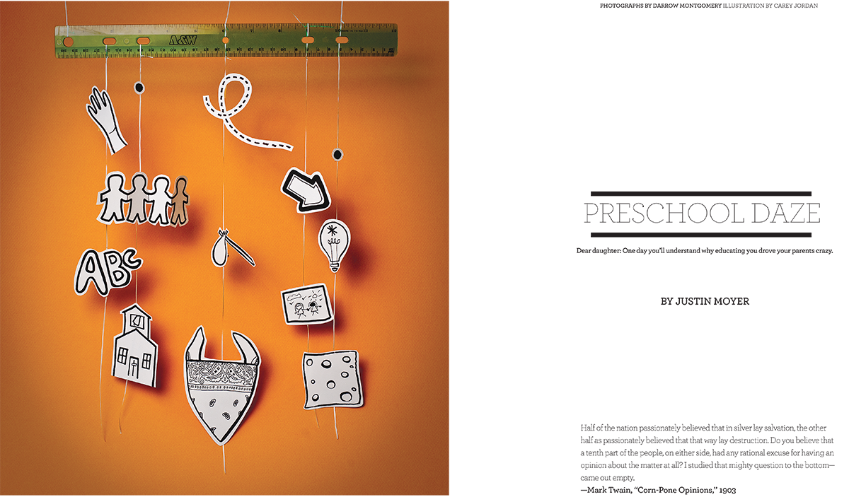
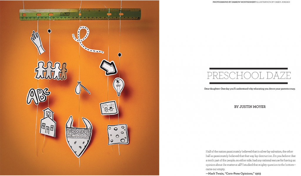
The pace is lightning fast on a weekly paper. Sometimes we get materials pretty late in the game but that’s the nature of being in a newsroom. We always strive to push creative boundaries even at the eleventh hour. Generally, most photos are taken by our awesome staff photographer Darrow Montgomery, but there are times where, because of the subject matter, we just don’t have access. That’s what happened for Preschool Daze—a piece that was written as an open letter to the author’s daughter about the challenges of picking a preschool. We are a small team, but working with those limited resources is what allows us to figure out how to best “McGuyver” things and it ended coming out great.
Luckily, most of the other paper sections adhere to a standard format, so that frees us up to work on pieces that are more labor intensive. Working at CP really pushed me to expand my skillset, achieving results that I didn’t know I was capable of. I’ve cut out a kid’s mobile with adult themes, played around with glitter, and even drawn a comic, so it’s definitely not the same thing over and over!
What are some of your favorite pieces that you produced at the City Paper?
One of the most exciting parts of putting together the paper is creating the covers. I shared the responsibility with our Creative Director, Jandos Rothstein, alternating weekly. Over the years we had a great rhythm going and he’s always been very encouraging when my “ambitious ideas” crop up. Having an amazing group of writers also pushes you to marry it with great concepts to create a visually engaging experience for the reader.
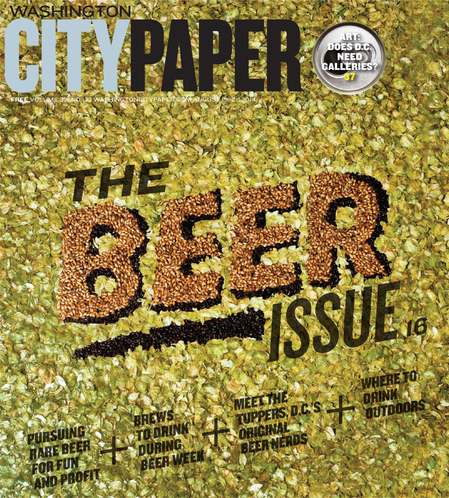
I really enjoy working with type, like creating type out of something. For example, with The BEER Issue, I created the title out of hops. It’s not necessarily that I loved the end result, because i think it could have been better, but the support I got from my teammates was phenomenal. There is a huge amount of freedom at the paper and I really loved and cherished it. It became one of my favorite covers because everyone got so involved and excited.
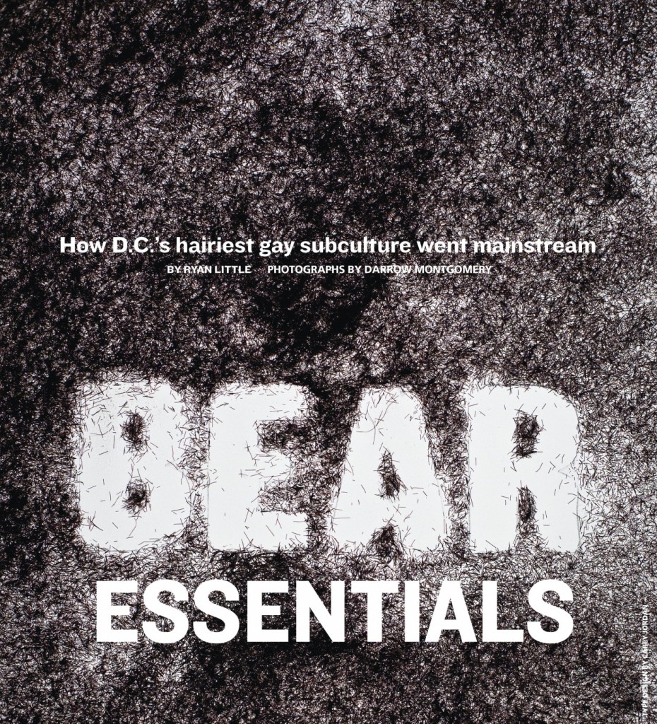
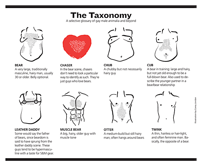
Another one that stands out was the Bear Essentials issue, which focused on the bear subculture in D.C. I knew immediately that I had to do something with hair, so I chopped up some of my own and created the type out of the negative space. It came out looking incredibly realistic in print. I also got to do some illustrations for a glossary describing the different classifications of gay males. I hadn’t really done that kind of work before and my team was super helpful and patient. It took me a bit longer to complete these, but the response was great once it was all done.
The “grazers” are also a lot of fun to do. The non-linear storytelling makes it interesting to lay out. For example, we do things like annotated illustrations of food, like the Biscuit Breakfast Sandwich Breakdown or infographics to breakdown DC politics.
What are some of the challenges you encounter as a designer?
Honestly, I feel like it’s a luxury to have a job that you love, so I can’t complain too much. But, just from the perspective of working for a weekly paper, the short turnaround. Sometimes ideas just don’t come to you. But because of the deadlines, you have to learn to be less of a perfectionist. Often there is no time for a Plan B.
My inner critic can be unruly and loud sometimes but it has its place in the process, and I’m still working on taming it. I also try to keep fresh by volunteering to teach design to youths who might not get exposure to the field otherwise—seeing what they come up with helps me to approach my own ideas from a different perspective.