Oliver Uberti is a visual journalist. He is the designer and coauthor of London: The Information Capital, a new book of 100 original maps and graphics. From 2003 to 2012, he worked in the design department of National Geographic, most recently as Senior Design Editor. His information graphics and art direction have won many international awards and he has given TEDx talks on the creative process. In 2010, Oliver designed 826DC’s Museum of Unnatural History—a non-profit tutoring and writing center built around the belief that “the world is as strange as you imagine it to be.” He left National Geographic in 2012 to form a design studio, Oliver Uberti Creative, in Ann Arbor, Michigan.
You started your career in Washington as a designer for National Geographic. How did you get that job?
Around the time I graduated from Michigan in 2003, National Geographic posted an opening for an entry-level designer. I applied online. I never heard back. I sent them a self-promotion package in the mail. I never heard back. Weeks passed. In July I was going to Africa with a scientific illustration class from my university. Before I left, I drove down to Washington, walked into their lobby with my portfolio, and called up to design director’s office from the security phone. It seemed like the only option I had left. When she answered, I said something like, “Hi I’m here for the job I saw on your website but I’m headed to Africa next week so this is my only chance.”
It worked. She granted me an interview the next day. Then I left the country.
In Malawi, I got an email asking for my references. Then we spent nine days incommunicado in Mozambique. When I finally reached an Internet café in Swaziland, there was a series of emails waiting for me, saying, “Where are you? If we don’t hear from you today, we have to offer the job to the next person.” I accepted, flew home on a Wednesday, and started work in D.C. five days later.
What did that experience teach you?
Working for NGM was like a 9-year postgraduate education. I studied under the experts’ experts. Though my focus was design, I felt as if I left with honorary degrees in photojournalism, writing, information graphics, cartography, and copier-repair.
My initial title was Design Specialist, then Designer, both of which were euphemisms for Design Apprentice. I spent my first four years assisting Senior Design Editors with their feature stories: fitting copy, building style sheets, setting drop caps, kerning headlines, cleaning layouts, dreadful stuff really. Was I frustrated? Yes. Did this sort of shadowing make me a better designer? Absolutely. For example: Print a caption in multiple weights at 8pt, 8.25pt, 8.5pt, 8.75pt, 9pt and then hang them on a wall to compare. It was like optical calisthenics. By the time I was promoted to Design Editor, my eyes had been trained: subtleties matter.
The hidden lesson here is PRINT EVERYTHING. The sooner the better. Screens are sort of like beer goggles; they make everything look amazing, immediately. Printing reveals the ugly truth: that logo is too big; that font size induces migraines. If you’re working on a print job, you HAVE to see what it will look like printed and trimmed. For sign projects, I make full-size prototypes and subject them to their actual viewing distances and lighting conditions. That initial investment of time, ink, and paper is nothing compared to the cost of reprints or worse, an unhappy client.
I also learned to trust my voice at the Geographic. Every Wednesday, cartographers, designers, and editors gathered to review maps for upcoming stories. I remember feeling like a kid at the adult’s table in those meetings during my first years on the job. I remember spotting ways in which information could be conveyed more clearly—simple stuff like color coding, hierarchy, label placement—but I was afraid to speak up. Surely everyone else was seeing what I was seeing. Over the years I realized that wasn’t the case.
You have a masters in creative writing from Johns Hopkins, how does your love of writing influence your design and vice versa?
My degree wasn’t an MFA in creative writing. Technically, it was an “MA in Writing” with a focus on nonfiction. We read, wrote, and talked a great deal about the differences between journalism, fiction, and this other, intriguing thing called “creative” or “literary nonfiction.” We talked about truth vs. Truth, our “contract with the reader,” extended metaphors, deliberate word choice, character-driven narrative, “show don’t tell,” and all sorts of ways to combine facts with art that were surprisingly analogous to the ways I was approaching design problems at National Geographic, especially infographics.
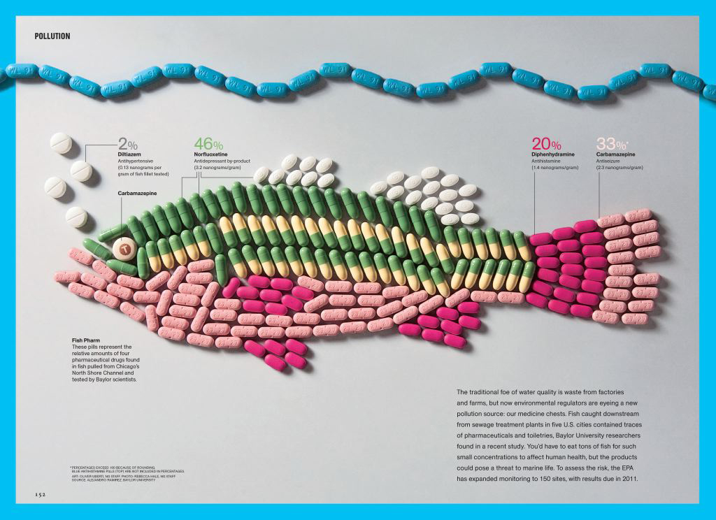
“Creative nonfiction” showed me that serious, informed, and important work could also be playful, beautiful, and surprising. It wasn’t an either/or. You could teach people about oil spill prevention by painting with crude oil. You could address human rights with typography. You could discuss the effects of Big Pharma on our environment with a fish made of pills. I learned that play doesn’t have to die once you start working. Truly, the quickest way to deaden your message is to suck out the play. Yet that’s not what most students hear, perhaps because their teachers didn’t hear that either. So the cycle continues: one generation after another, sucking the fun out, deadening the world. The arts keep play alive.
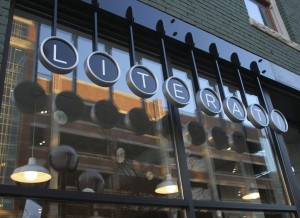
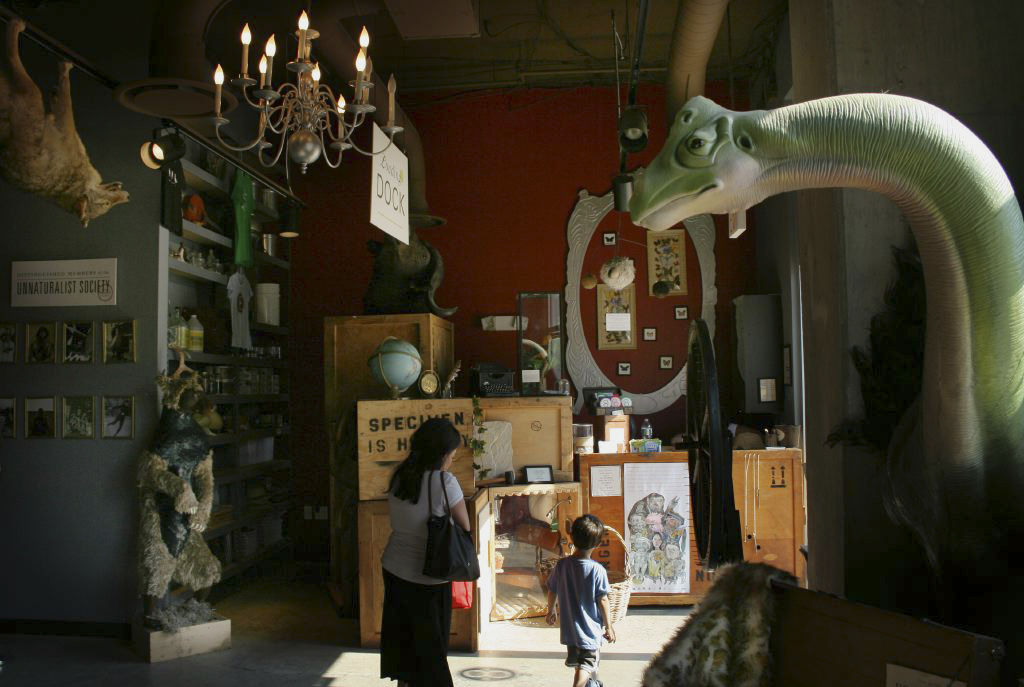
One of the few respected means of play for adults is metaphor. Through metaphor we create unexpected connections. Designers are lucky. Branding work is really an exercise in extended metaphor. How else can you turn a computer company into a piece of fruit? Recently, I’ve been working on a series of projects that turn a bookstore into a typewriter. In D.C., I recruited volunteers to help me turn a tutoring center into a Museum of Unnatural History. We welded a cave, inverted taxidermy, and invented a society of scienticians, explorographers, and experimentationists who believe “the world is as strange as you imagine it to be.” Now that’s a message to show our kids.
You describe yourself as a visual journalist, how would you define that through your work?
That’s a prickly one. So here comes my longest answer. To be honest, “visual journalist” is starting to make me cringe. I’d like to try to explain my discomfort. Students may want to consider this a career caveat.
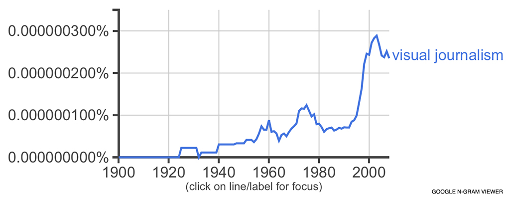
Plug “visual journalism” into Google’s N-gram Viewer and you get this chart of the phrase’s use over time. It gradually rises in conjunction with photojournalism and then spikes during the tech boom of the 90s. As recently as 2000, the National Press Photographers Association was using “visual journalist” in their Code of Ethics to describe photojournalists and videographers. They weren’t referring to cartographers, artists, or political cartoonists; they certainly weren’t factoring in dataviz.
By the late-2000s something started to change. A lot of us in the design and graphics departments of major newspapers and magazines felt we needed to distinguish the work we were doing from that of other designers and graphic artists. Because the work we were doing WAS different. We were busting down silo walls, combining the skills of researchers and reporters with the visual acuity of artists and the data analysis of statisticians. Some preferred “data journalist.” For me, “visual journalist” better suited my skill sets. It was a self-appointed statement of pride: I think visually.
Now it’s not uncommon for HR departments to post job descriptions for visual journalists. Too bad they often read as if they’re recruiting a chef to cook five entirely different cuisines. The Wall Street Journal is currently seeking a reporter who can “tell stories and present information in creative ways, including via graphics and charts, data, photos, video and/or social media.” Good luck with that. I’m not saying such multivalent individuals don’t exist. They do. But I’m not certain that anyone can do all of these things at the same time, at least not well. How many photographers have been asked—naively, maddeningly—to capture photo and video on the same shoot? “All you do is flip a switch.” (Sigh.)
It’s scary. Having watched journalism Tough Mudder through a recession and a gauntlet of e-obstacles, I understand the pressure to cut costs. Thus, the HR definition of v.j. as multimedia wunderkind may actually be a not-entirely-unexpected publishing strategy to get 1) five employees for the price of one; and 2) a trove of hyper-visual “snackables”—a.k.a. clickbait—with which to increase likes, shares, page views, ad impressions, revenue, subscriptions, bonuses, etc.
Colleges are now complicit in the same way that they indulged last decade’s memoir/travel writing boom—my own MA included for sure. For example, the University of Georgia offers ‘Journalism with a Visual Emphasis,’ a track that prepares students to tell stories through “photography, audio, video, and multimedia.” An info sheet from their Career Center entices prospective v.j. majors with 24 possible career paths: Community Journalist, Communications Specialist, Copy Editor, Digital Artist, Editorial Assistant, Foreign Correspondent, Freelance Journalist, Graphic Designer, Music Editor [?!], Multimedia Journalist, Online Editor, Photo Editor, Photographer, Presentation Editor, Production Assistant, Promotions Assistant, Proposal Writer, Public Relations, Assistant Publicist Reporter (online, print, broadcast), Script Writer, Technical Communicator, Website Editor, Writer. If that last one doesn’t embody the confusion I’m addressing, I don’t know what does.
When I meet someone in person now, I usually just say “designer,” though this carries complications, too. My main beef with “designer”—even “graphic designer”—is that it elicits the immediate follow-up: “What kind?” For someone who enjoys working on a wide range of projects, this question can be paralyzing. Either rattle off current projects as evidence (which in my experience tends to appear boastful and tactless) or take the coy route and say, “You know, different things” (which can lead to annoyance, disinterest, or the dreaded “like what?”). I bet this happens with a whole class of titles today—e.g. Producer, Developer, Engineer, Artist, Creative—titles that indicate a person makes but not what is made. That’s why I kind of envy cartographers. They make maps.
You recently designed and co-authored a book of maps. How do you know your coauthor James Cheshire and how did you come up with the idea for this book?
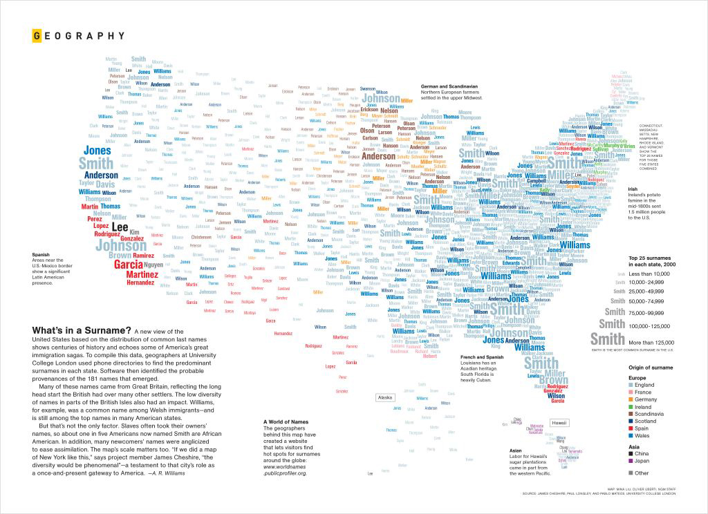
Back in 2010, I heard about his research at University College London on the geography of surnames. I contacted James to see if he could help me produce a map of the most popular surnames in the U.S. The resulting graphic (below) won a number of awards, one of which took me to London in September 2012. I stopped by James’s office to say hello. That’s when he asked me if I wanted to work on a book together. On that day, the collaboration was born: What if we took all the data we could find—on happiness, house prices, art, violent crime, life expectancy—and created a new visual guide to London for the twenty-first century?
What was your favorite part of creating this book?
Collaborating on a book requires an enormous investment of time and a complete forfeiture of pride. You must be willing to offer terrible, embarrassing suggestions in hopes that they’ll trigger better ones. Your subject and your coauthor become two of the closest relationships in your life. So I’d have to say my favorite part of the project was getting to know James and one of the great cities of the world.
We also couldn’t have asked for a better partner than the team at Particular Books. Early on, we discussed dimensions, page count, binding, and paper. As the book’s visual identity emerged, anything I asked for—transparencies, silver foil, no dust jacket—they provided with enthusiasm. It was a designer’s dream.
What was the most challenging part of creating this book?
We had to produce 100 graphics in about nine months. That means researching, designing, writing, and revising one graphic every three days. At National Geographic, we would typically take months to produce a single map.
How did you decide what data to include? How did you choose to illustrate the data?
At Hopkins I learned to start with a topic, research it, find an angle and then craft a form. My approach to infographics follows a similar rubric: topic, data, angle, form.
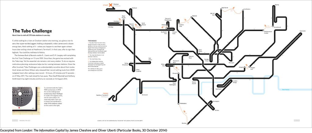
To find topics and data, James and I read a lot, scoured London’s datastores, and talked about what WE thought would be cool to see visualized. The idea for mapping the Tube Challenge (below) came while we were looking at one of Mark Wallinger’s “Labyrinth” artworks in the Russell Square Tube station.
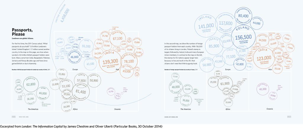
Sometimes you have the topic and data (and possibly a desired form) but need the angle. Finding an angle requires knowing what you want to say and in what order. That’s the real challenge. Our passports graphic (below) is a good example. We knew we had data from the 2011 Census that listed what passports people held, and I knew that a bubble map of passport stamps would look pretty sweet, but it wasn’t until I sifted through the data and reports that I noticed a) the inverse distribution between the country of birth of British passport holders and the nationality of foreign passport holders and b) why that inversion exists. The data justified the form, not the other way around.
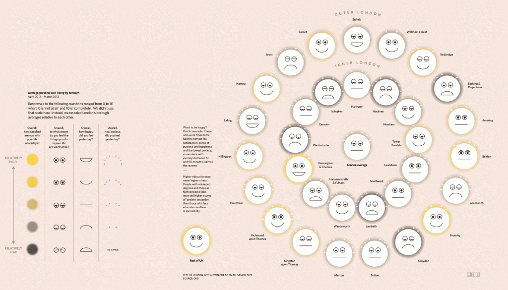
Only once I know my topic, data, and angle do I start sketching out possible forms. Take Islington Has Issues (below). I had found some experimental data on personal well-being from the Office for National Statistics. After reading the reports, I knew I wanted to compare the life satisfaction, sense of purpose, happiness, and anxiety of London’s boroughs but I didn’t know how to map four different variables across thirty-three boroughs. I wrote to James. He suggested Chernoff Faces.
What was your experience working with the data output software for this project?
James handled any graphics that required cartography or heavy number-crunching using a statistics programming language called R and a Geographic Information System called QGIS. He then exported those initial plots as PDFs and loaded them into Illustrator before passing them to me to prettify. We provide some before-and-after examples in a blog post on our site.
Information graphics seem ubiquitous these days. How do you feel about this trend?
For us, it was not enough to program scripts to generate patterns from data points. James and I tried to go the next step to help you understand what the patterns mean. That’s what I find so lacking in a lot of stuff circulating the Internet. Many graphics aren’t communicating information. In my definition, that’s what a visual journalist really aims to do. The job’s not about multimedia; it’s about helping people to see their world.
Any plans to do another city?
London collects and shares more data with its citizens than any city in the world. We very deliberately say London is the information capital as a challenge to other cities to see if they can prove us wrong. We hope we have set the bar pretty high.
%8Fv%91%92q%1D%7D%12%88%98%99%9A%1B%9C%10%88%89%9Fy%93%A2%86%1A%9E%A7%8B%8C%2F%AB%18%A5%AE%A0_%AA%8E%AC%90%B5%B6%60%19%A3%0D%AD%BC%AF%A1(%B2%9D%BB%C3%C4h%BF%C7%A4%C9%CA%A8%A9A%CE%0E%B4%D1%BD%7B%10%C0%0A%C2%D8%D2%C5%DB%D5%0C%D7%DF%CB%B7%13%B9%C8%97x%02%EE%02%2B%B0%D47%13%DEln%1E%EF%EF'%F2%2B%F6Zd%3A%E8%1Bhb%9A%3Fv%F7%DAp%18%C8%90%84%C1%13%D0%C6%94%CB%C0%B0%E2%08f2%14%02%2Ce%8A%FFb%C5%86U%B4%B5(%B3%91%A3%C0%8F%20%CD%CD%E2%08h!%CA%94*%AD%B1l%99%EF%25%C1%98%0Bf%D2%1Ca%F3fL%9D%F8X%F4%D4g%0EhG%17C%F7%0D3%EA%23%A9%3B%5EL%818u%054%C9P%AA%2C%DF%D8%C4%FA%8F%CAK%AE%08%15Y%AC%15%F6%13%D1%A5%3Bq%AA%5D%CB%B6%AD%DB%B7p%E3%CA%9DK%B7%AE%DD%BBx%F3B4%DA%F5%1B_a%7F'%16%0D%0C%89%B0%E0h%86%13%F3%FD%A9%B8qV%95%8E%23%F7%85*%D9Me%B5%97%BB9f%1BY%AF%E7%CF%A0C%8B%1EM%BA%B4%E9%D3%A8S%AB%C6A%92r%D0Se1%C5~s8P%ED%24%26a%DF%1E2%13%EC%E4%1CUu%F7%06%12%D5wn%E0%C1%5D%0F%9FQ%1Cq%F2%83%3A1%3FO%F8Xzt%EA%C7%DB6%AFs%5D%EE%F4%95%D5%25%BEv%D1Z%7Cv%F0%BB%EB%05%CC%B8%DERz%99%BF%D5kd%11%91%C3y%F9%F3G%D4%2F%B1%DF~%FF%08%BC%F9%E9%F7_I%EDaW%12t%01%3EP%DE3%B3%B9g%DB%80%9A-%A8%20%84%8CAha%7C%90Q%A8!%85~a%B8!%87%CE5%18%8C%88%E4%80%88%16%89%25%26%C8%A0%8A%19%A2%98%93%8B%11%B2%D8!%8C1J%08%A0%89%9F%BC%97b%81%F8%C9x%A2%8F%F0%F1%D8%A3%8D%CA%E8%B8%23%91%2B%02)%9C%92%232y%24%92%C6%A55%E4x~%E0H%9B%95%04%60%89%A1%22%5B%06%09%E5%8D4%9Aa%A4%97RNY%26%97X%D6x%E6%3ANv%91%A6%9ATr%D7%26%15of%19%26%99q%E6(%A4%7Fs%929%E3Q%EE%7D%89%1Eiu%AAVhj%87%A2%96%E8i%8B%9A%D6%A8%A3%7B%AE%C6'%A0%AE%24%00%00!%F9%04%05%05%00%04%00%2C%0A%00%02%00W%000%00%00%03%FFH%BA%DC%FE0%BE%40%83%BC8%EB%3D%2B%E5%60(J%9E7%9E(WVi%EBv%EB%2B%BF%EB7%DFgm%E1%3C%A8%F7%23%81P%90%FA%A1%00H%40k8D%19G%C9%24%8A%C9%CC%D5N%D1%E8%89%DA%1C%3DCYi%90%2B%F4%5EEa%B1%88%DC%F5%9DAi%F5%9A-%FAn%E2%CA%14%9B%E8%8E%C1%E3.%7B!v%19x%2F%82*o%1A%86%87%88%1A%84%12xy%8Dd%89~%8B%803%7B%7C%19%90%10%928%8E%18%9E%0F%8C%A1t%9D%8A%91%99%3C%A2%24%AA%11%A6%AD%A8%17%A4%0C%B2%B3%B4%11%B6%0A%A0%40%0A%AE0%25%18%B8%3D%9B%B5%B0%0D%BE%BF%C0%BA%10%97%B1%AC%10%03%D4%03%81%CE%C2%C4%D2%0F%D5%D5K%D8G%DB%0D%DD%E4z%952%E2%E3%E4%E5c%5C3%E9%0C%EB%F2%EDm%E8Y%18%F2%F3se%3CZ%19%F9%FA%98%09%04%18P%E0%2F%82%EB%0C2C%C8N!%10%86%DD%1C%1E%84HMb%0F%8A%15-%F2%C0%A8%F1%13%22%C3%8E%0F%09%82%0C%99o%E4%C4%86%26IZK%A9!%01%00!%F9%04%05%05%00%04%00%2C%1F%00%02%00W%000%00%00%03%FFH%BA%DC%FEKH%01%AB%BD8%EB6%E7%FE%60%A8u%9Dh%9E%22%E9%A1l%5B%A9%92%2B%CF%04L%D1%F8i%E7%7C%B8%F7%A2%81p%C0%FA%9D%02%C8%40k8D%19E%C9%24%8A%C9%D4%C1%8EQ%A9%89%DA4%3DAYm%90%2B%F4%5E%A1a%E4%89%DC%05%7D5i%F1%98%9C%3A%83%E3K%B6%CF%BE%89%2B%F3tn%7Cpx.lD%1Fo%17~3%87%88%23%83%8B%8C%8Dz%1B%8A%15%93%94%95%19%97%0F~%7F4%87%96%91%98%859%A2%9C%A4%9E%A6%A7%9B%17%9D%0D%99%3C%A8%AF%AA%B1%AC%B3%B4%2F%B6%0B%9F%40%0B%BA%10%B0%0A%B2%40%8E%B5*%92%B8%C6%AE%C2%24%18%C5%BF%04%C1%0F%25%CAa.%00%DA%00%18%D4(%D1!%DB%DB%DD%812%CB%20%E2%E9%17%CD%2C%E7%1A%E9%F0%E4U8%D8%22%F0%F7%19%F39Q%26%F7%F8%D2%D2%FC%FD%03%D8C%E0%40%828%0C%C6C%C8C%A1%3A%86%09%1D%8E%83HC%E2D%8A3%2Cj%C3X%D1%14%22%C7%88%0A%3F%E6%08)r%A4%C0%92%05%17%A2L%B9%D1D%02%00!%F9%04%05%05%00%04%00%2C%3C%00%02%00B%00B%00%00%03%FEH4%3C%FA0%CAI%AB%9D%AD%DD%CD%7B%CD%99'%8E%16%A8%91hj2i%3B%AE%8E%2Bo%F0l%7F%EB%ADG%B5%2B%FC%82%DD%A3%97%02%02%85%8B%5C%D1x%DC%11I%CC%A6%EE)%8AJo%D4%8E%F5j%CBr%B6A%A1%F7%02F%26M%D0%ADy%5C)%AF%95Z7%92%3D%91%CF%E1%1Bp%F8%8D%8E%5B%CDCx%16v%7C%20~Q%80%81%7Ddj%89%0At%0Az%8E%8F%82u%8D%93%90%92%93%94!%8C%7F%9B%8A1%83%97.%01%A6%01%3B%84(%A7%A7%3A%A4%AB%AC%AC7%AF%22%B1%B6%AEL)%B6%BB%A9%5C%1E%BB%BC%A0%1B%C0%C1%C2%15%C4%C5%C6%12%C8%B7%CA%14%CC%B1%CE%13%D0%B2%D2%11%D4%AD%D6%D7%D8%A8%DA%10%DC%DE%CB%D0%E1%D3%C8%E4%CF%C4%E7%C7%CD%EA%EB%A6%ED%F0%F1%F2%F3%F4%F5%F6%F7%F8%F9%FA%FA%00%FD%FE%FF%00%03%024%26%B0%A0%C1%7F%A0%0E*4%B8i%A1%C3%81%93%1EJ%04%D0p%A2%C3%84%16%0F%12%CC(%03PA%02%00!%F9%04%05%05%00%04%00%2CN%00%0A%000%00W%00%00%03%ECH%BA%BC%F3%A3%C9I%2B%85%D0%EA%7Dq%E6%E0%E6%7Da)%8D%A4%A9%A2%A9Z%B2%91%BB%B2%B2%0B%D7%E6%8D%87p%BCs%BA%9F((%B4%10%8B%1D%14r%A8%5CV%8ENF%2F%9A%1CQ'%D3k%03z%E5%AA%04%60%81%91%B6%0B%87%9F%CD%9Ay%5D%C5%A8%D7%EC%B6%CF%04%AF%8F%1F%B2%BA%9D%AA%DF%3B%FB~H%80p%7C%83fQ%86%87%7F%89%60%85%8C%8E%86Z%89Z%0A%83%94%0B%80%97%0C%81%9A%95g%9D%A0%A1%A2%A3%A4%A5%A6%A7%A8%A9%AA*%01%AD%AE%AF%B0%B1%B05%B2%B5%B6%AF.%B7%BA%B6%AC%BB%BE%B8%26%BF%C2%01%BD%C3%BB%B9%C6%B7%B4%C9%B2%AB%CE%CF%D0%D1%D2%D3%D4%D52%00%D8%00%A5%D9%DC%A2%DC%DF%DA%9D%E0%DF%E2%E3%E4%94%E6%E3%E8%E9%E0Z%EC%ED%EE%EF%DD%F1%F2%D8%F4%F5%EB%F5%E1W%FA%FB%FC%F8%F9%D8%95K%17%8A%A0%B7s%A3%E6QH%00%00!%F9%04%05%05%00%04%00%2CN%00%1F%000%00W%00%00%03%E9H%BA%DC%FEn%C8%01%AB%BDmN%CC%3B%D1%A0'F%608%8Eez%8A%A9%BAb%AD%FBV%B1%3C%93%B5v%D3%B9%BE%E3%3D%CA%2F%13%94%0C%81%BD%231%A8D%B6%9A%8F%1C%14R%9B%F2L%D6%AB0%CB%EDz%BF%E0%B0xL.%9B%CF%5C%81z%CDn%BB%DB%B3%B7%7C%CE%5E%D1%EF%F3%13~%0F%1F%F1%FF%02z%80%7Bv%83tq%86oh%8B%8C%8D%8E%8F%90%91%92%93%0A%01%96%01f%97%9Ac%9A%9D%98%60%9E%9D%A0%A1%A2%5D%A4%A1%A6%A7%9E%5C%AA%AB%AC%AD%9B%AF%B0%96%B2%B3%A9%B3%9FY%B8%B9%10%00%BE%00%2F%B8%15%BF%BF%C1%B0%BD%C4%C5%C6%A7%C8%C9%C07%CC%0F%CE%CA%D0%A5%D2%D3%CF%3B%B1%C3%D8b%D8%BE%DE%DDa%DF%D9_%DFc%E7%E3%E2%EA%D3%E1%EB%E6%EF%5E%E4%EE%CE%E8%F1%5D%E9%EC%F5%FA%FB%60%F9%FE%ED%E8%11%23%D3%CF%1E%B8)%09%00%00!%F9%04%05%05%00%04%00%2C%3C%00%3C%00B%00B%00%00%03%F9H%BA%DC%FEP%8DI%AB%BD6%EA%1D%B1%FF%15'r%60%F9%8D%E8c%AEY%EAJl%FC%BE%B1%3C%BB%B5y%CF%F9%B9%FF%C0%A0pH%2C%1A%8F%C8%A4r%C9l%3A%9F%D0%A8tJ%10X%05%D4%D7u%9B%1Dm%BF%D8%AE%06%FC%15G%C8%60%B3%03MV3%D8mw%15%5E%96%CF%E9W%FB%1D%1Fv%F3%F3v%7FVz%82F%01%87%017%7FD%88%88%8AxC%8D%8D%3Bt%91%92%87%40l%96%97%89%99u%11%00%A1%00%1C%9C%98A%5C%1A%A2%A2%A4%A5O%AA%AA%1B%A5%A6L%AF%AB%B1%ADM%B5%A1%AC%B8K%BA%A3%BC%97%B9%BA%23%B2%B4%C4%22%C6%BE%C8%C9%BDH%BF(%B2%9D%CF%CC%CD%9CJ%D0%D1%CAG%D9%DA%D7%D4%B5%2F%DBE%DD%DE%C2%DC%D5%E6%92%E8%E1%E2%E3B%E5)%EFA%F1%F2%DFD%F5%EA%8E%E4%E9.%E7%FC%EDvLb%F7J%8F%83%7Cv%10%CAQ%E8%86%A1%1A%87%0F%0B%1A%7C%00kb%83%04%00!%F9%04%05%05%00%04%00%2C%1F%00N%00W%000%00%00%03%FFH%BA%DC%FE0%CA7%EA%988%EB%CD%89%FD%5D(%8E%CDg%5Ed%AAJ%A7%B9%BE%B0%D7%BAq%1D%CE%AD%ADkx%BE%FF%90%DE%09Ht%08i%C5%E4%11%94%2C.-M%E5%13%15%05N5%80%2C%E0'%E8%0AFO%8CV%AB%F3z%C1%C7%C9x%5C3%9BIB%F5%3A%DBvwU8%C9%9C%1C%B3%9F%F1H%10%7Bt%13%01%86%01%18~w%2BL%11%83%5B%85%87%86%89%8AQ%8F%90%11%92%92%13%8A%8BE%8F%18%9A%87%94~I%97%A1%A2%88%9C%9D%9F%83%19%A9%AA%AB%A5%40%A0%AF%A9%1A%AC%3F%B5%A8%A2%B8%95%3B%BB%BC%9A%1B%B95%A7%1A%B0%C4%C50%C1%C2%9B%CA%B3%CC%CD%91%BD%D0%D1%2B%D3%D4%C3%1C%CB)%D9%DA%CF%DC%BF*%DF%12%C9%1D%DD%22%E5%E6%B7!%E9%1C%C7%1D%E7%E8%EFX%AE%22%F3%F4%D7%1D%F7%F8%ED%22%E3B%F4%0B%91O%9F%1BokR%144%E8%89%04%1B%85%FFF%BC%A9%E2l%14%C5(%0B%2F%FE%C8%A8Q%13%07%C7%8E5%3E%82%84!r%E4%8Bj%26%89%84K%A9%20%01%00!%F9%04%05%05%00%04%00%2C%0A%00N%00W%000%00%00%03%FFH%BA%DC%0E%10%B8I%AB%BD8%B7%C8%B5%FF%E0%C7%8DRh%9E!9%A2lK%A9%A4%2B%B7%B0%3A%DF%60m%E3%3C%A6%C7%BD%E0%E4%B7%12%1A%17%C4%CEq%99%8C%2C%8FM%C8%13%DA%9CR%89%A7%806%20%1Cx%07%99dv%AB%ED%7D%BF%3E%1D%8AL%C6%9D%CF%97Z%8B%BDu%BF%BDi%25%8B%5E%BF%DD%D1qN.%7Ce%17%02%87%02%18%7FxV%04%84%5C%86%88%87%8A%8BV%8F%90%15%92%92%17%8B%8CK%8F%18%9A%88%94%7FO%97%A1%A2%89%9C%9D%9F%84%19%A9%AA%AB%A5F%A0%AF%A9%1A%ACB%B5%A8%A2%B8%95A%BB%BC%9A%1E%B98%A7%1A%B0%C4%C53%C1%C2%9B%CA%B3%CC%CD%91%BD%D0%D1%83%AE%1F%C9%1F%CB%7B%D9%DA%B7%20%DDc%7C!%DB%DC%BF%DE%E5%E6%E1%E2%E9%26%C7%20%E7%E8%EF%20%D3%C8%ED%EE%D7%F6%EB%26%F3%FAo%D6%F4cW%CDD%3D~mP%FC%03%E8I%60!%85%F9%0C%02jDm%18E%2B%0B%2F%0A%C9%A8%B1%12%07%C7%8E8%3E%82%9C!r%A4%8C%82%26%8D%3C%E3%91%00%00!%F9%04%05%05%00%04%00%2C%02%00%3C%00B%00B%00%00%03%F5H%04%DC%FE%F0%A9I%AB%BD%98%C6%CD%5D%FE%E0%D5%8D%5Ch%82d*%9D%AC%A5%BE%40%2BO%B0%3A%DF%F5x%EF%F9%B6%FF%C0%A0pH%2C%1A%8F%C8%A4r%C9l%3A%9F%D0%A8tJ%3D%05%AE%81%AA%0C%CB%D5%9A%B8%E0%AC7%13%06%8F%2F%E5%F0%99%92.%AF%09m%F7%3A%AE%3E%D3%CD%F6%3B%F6%AD%DF%E7%FB%7C%80%81w%3B%02%86%02Fz%85%87%86Et%3F%8C%8CDmA%91%87%8Ex%40%96%97%98WC%9B%8D%20%03%A3%03R%A0%88%A2%A4%A3P%A7%A8%19%AA%AAO%A7!%B0%A4N%AD%B4%B5%A5M%B3%B9%B5%BC%A0'%BA%BBK%BD%BE%B0L%C6%C7%B1J%B8%C2%BA%C5%C1%2C%C3%CD%CA%CB%B6I%D6%D7%ABH%DA%DB%C4F%DE%A9%BFG%E2%E3%C8%E1%E6%1F%D4%E9%9B%3B%ECE%D27%F0D%F23%F4%F5%91%40%F8%F9%A1%3F%FCo%26%00%0CH%60%60%40%83o%10%AEQx%86aCt%0410K%00%00!%F9%04%05%05%00%04%00%2C%02%00%1F%000%00W%00%00%03%E7H%BA%0C%0E%2C%CAIk%7B%CE%EAM%B1%E7%E0%E6%8Da)%8D%A8%A9%A2%A9Z%B2%AD%CB%C1%B1%AC%D1%A4%7D%E3%98.%F2%0F%DF%0E%08%11v%88E%E3%04%A9%AC%00%9B%16%1C4%0A%9B%0E%7B%D6_%26%CB%EDz%BF%E0%B0xL.%9B%CF%A1%80z%CDn%BB%DB%B6%B7%7C%CEv%D1%EFs%15~%0F7%F1%FF%01z%80%7Bv%83tq%86oh%8B%8C%8D%8E%8F%90%91%92%93h%02%96%02f%97%9Ac%9A%9D%98%60%9E%9D_%A1%9E%5D%A4%A1Y%A7%A8V%AA%A5S%AD%A2%AF%B0%97%A9%B3%96%AC%B6%9F%B2%B3%5C%B62%03%C0%03%16%BC.%C1%C1%15%AD6%C6%C6%14%A7%3E%CB%C7%CD%B1%3A%D0%D1%D2%B7B%D5%C0b%DA%C2a%DD%DE%60%DD%DC%E3%DF%DA%E4%D5c%E5%E2%E7%E6%ED%EC%E9%EE%F1%F0%D0%E8%F5%F6%CB%F8%CC%F2%F7%F4%F9%FA%DB%D4%CD%D3wf%9F%86%04%00!%F9%04%09%05%00%04%00%2C%02%00%02%00%7C%00%7C%00%00%03%FFH%BA%DC%FE0%CAI%AB%BD8%EB%CD%BB%FF%60(%8Edi%9Eh%AA%AEl%EB%BEp%2C%CFt%0A%DC%40%AD%938%BE%FF%9E%5E%0FH%CC%08%7D%C5%24%E5%88T%3A%1D%CC%E6sJ%88%E6%A8X%2B%96%AA%DDN%BB%5E%A5%F5%1AN%82%CB%C41%DA%1C%5D%B3%99%EEt%3B%0E%3C%D3i%EA%BB%CE%AE%8F%E5%FB3%7C%80%12%01%85%01!%82%83%0E%86%86%20%89%8A%0B%8C%92%1Fs%90%10%92%98%1D%95%96%8B%98%99%1BG%9C%11%9E%9E%1CC%A2%A3%A4%9F%A8%26%AA%A5%AC%AD%AE%93%B0%24%B2%B3%B4%23%B6%8C%B8%B5%BA%85%BC%22%BE%BF%C0!%C2%C4%C1%B6%C7%B9%AE%CA%CB%A4%CD%BD%B7%D0%CE%87%D3%D6%D7%D8%D9%DA%DB%DC%DD%DE%DF%E0%E1%C0%02%E4%E5%E6%E7%E8%E7%DC%E9%EC%ED%E6%DA%EE%F1%ED%D9%F2%F5%EA%D8%F6%F9%02%F4%FA%F5%F0%FD%EE%D6%01L'%AE%A0%C1%83%08%13*%5C%C8%B0%A1%C3%87h%06H%1C%00q%C1%C4%8B%10%2Fj%A4%D8pP%A3F%86%1E7*%0C%E9%11!%C9%92%07O%8A4%A8%F2%23%CB%96%13M%C2%94%98r%26%C7%970%13%CE%5C%98%93%E7I%87%24%2B%AE%ACH%00%23%D1%A3H%93*%5D%CA%B4%A9%D3%A7P%A3J%9DJ%B5%AA%D5%ABX%B3j%DD%CA%B5%AB%D7%AF%60%C3%16I%00%00%3B)
Loading image
Click anywhere to cancel
![]()
![]()