Antonio Alcalá, founder of Studio A and AIGA DC fellow, is also an adjunct faculty member of the Corcoran College of Art + Design and a past president of the Art Directors Club of Metropolitan Washington. He is also responsible for the design of US postage stamps as an art director for the United States Postal Service.
Picture this: a crisp fall Sunday morning, strolling through the quaint streets of colonial Alexandria, popping into a row house and being greeted with cider and a curated selection of design books for you to make your own. Lucky for you, this is an actual event that will kick off DC Design Week this October. Antonio Alcalá, the award winning designer and founder of Studio A, is opening his doors for a book sale that will benefit the Design Continuum Fund. We asked him a bit more about his collection, his reflections on the last 30 years in DC, and his generosity. Below is just a sampling of the books that will be available for purchase.
Tell us a bit about your collection and how it came to be.
Well, just to clarify, I am not selling off my personal collection. This book sale consists of doubles, extras, and miscellaneous books that I don’t need, or were donated for the sale. Some were given to me by designers who were downsizing, others are books that no longer fit with my current interests. If I had unlimited space and time, I would keep them all!
What books inspired you as a budding designer?
When I started out, there were very few books about graphic design available in local bookstores. But when I entered into the graduate program at Yale, I had the good fortune of being surrounded by instructors such as Paul Rand, Armin Hoffman, and Bradbury Thompson.

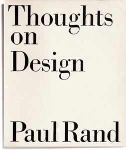
One book that I remember buying early on was Rand’s “Thoughts on Design,” a used copy from 1947. This book is one of the first texts that wrote about graphic design, not just as a technical printing manual, but more as a conceptual and aesthetic art form. In it he uses his own design work to demonstrate particular ideas and philosophies he had about what graphic design could be. At that point nobody had written about design in that way. It was very exciting, and even for me, finding this book again almost 30 years after it was published, it was still just as fresh and relevant.

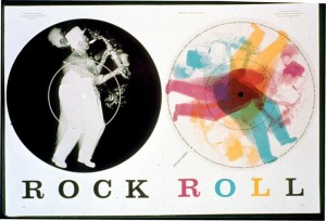
Bradbury Thompson’s work for Westvaco, a small magazine for the West Virginia Paper and Pulp Company was also incredibly inspiring. For over 20 years he created innovative design experiments for their publication, “Westvaco Inspirations,” to demonstrate the superior quality of their printing papers. Bradbury took this as an opportunity to use a variety of printing methods and experimental layouts to create unusual and exciting results. One of his more famous spreads was “Rock Roll,” where he juxtaposed a negative black and white photograph of a saxophone player on a black disc against the same image printed in cyan, magenta, and yellow, for which he shifted each plate to suggest movement. In our contemporary computer age that might not seem innovative, but at the time it was groundbreaking. He introduced the language of modernism, playful typography, and non-traditional imagery to a broader audience.

If I had to choose just one more publication I would say the early issues of Émigré. They were one of the first magazines to use Macintosh computers and while most designers saw only limitations of 8 or 16-bit to render fonts properly, Émigré embraced them. They initially published the magazine as a showcase for their own interests and type explorations and later often handed it over to others to showcase their own work. It was never about creating the clearest, most legible type, it was about investigating what was possible with this new medium. Deconstruction was a very popular idea within graphic design, layering typography to create different layers of meaning, even to the point of being illegible. These magazines are great examples of experimental typography.
Some other titles not to miss are from Chip Kidd, Pentagram, Sagmeister, Lester Beall, and Graphis.
AIGA DC turns 30 this year and you have worked in Washington for many years, how have you seen the D.C. design scene change?
The DC design scene has changed like the rest of the field during the past 30 years. It is much more diverse in what it embraces, from digital to print to motion, and from entrepreneurship to social awareness to the good old standby: federal design. Also, for some reason, the designers keep getting younger!
What inspired you to donate the proceeds of your book sale to the Design Continuum Fund?
Most everyone who is a professional designer can count at least one person who made a huge difference in their career. Maybe it was a teacher or employer, parent or friend. How great is it to be able to pass that gift along? By supporting the Design Continuum Fund, I’m helping promising students complete their design educations with scholarship aid.
On a separate note, any fellow designer is welcome to give me a call or stop by the studio to see the rest of the library that isn’t for sale!
EVENT DETAILS
Books and Beats for a Benefit
Sunday, October 19, 2014
10:00 AM – 4:00 PM
Studio A
1019 Queen Street
Alexandria, VA 22314
Pascale Vonier is an AIGA DC board member, communications director for the Association of Collegiate Schools of Architecture, and managing editor of the Journal of Architectural Education.